Mobile Friendly Design
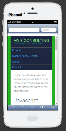
With the rising trend in popularity for web browsing on a mobile device it is vitally important to ensure that a website works in various screen resolutions and delivers a good user experience across a range of devices.
These devices may differ in resolution from 320 pixels on an older mobile phone up to 3840 pixels on a 4K television. So this presents challenges for theme design and makes old style web design obsolete with an urgent need to re-design older websites that were designed for glass tube desktop monitors.
Old style web designs are likely cropped by mobile browsers so that large areas of content can only be accessed by scrolling sideways. Also, text and image sizes may appear too large or too small.
Now it is necessary to adapt the page layout and relative sizes of page elements as the screen resolution changes. This is called mobile-first or responsive design.
Other factors come into play too such as bandwidth where we want to avoid wasting a mobile user's data allowance and to minimise download time. Page speed and mobile friendliness are now becoming important factors in search engine ranking along with security.
Older websites are often insecure where in the worst cases, user passwords are transmitted in the clear or more often it's a case of no privacy where your browsing activities are easily monitored. Now it is easy to upgrade to secure encrypted web hosting. The technology has now evolved such that the time lag associated with establishing secure internet connections does not negatively affect the user experience.
Modern web browsers even alert us if a website is not secure and offer information on the privacy settings of sites that we visit.
Here at AW E Consulting we understand all of these issues very well and are able to deliver robust solutions incorporating mobile friendly design. If you are associated with an old technology website, let us modernise it for you to help your business thrive.